'/%3E%3Cpath fill='%23ffffff' transform='translate(256 256) scale(0.6) translate(-256 -256)' d='M501.1 395.7L384 278.6c-23.1-23.1-57.6-27.6-85.4-13.9L192 158.1V96L64 0 0 64l96 128h62.1l106.6 106.6c-13.6 27.8-9.2 62.3 13.9 85.4l117.1 117.1c14.6 14.6 38.2 14.6 52.7 0l52.7-52.7c14.5-14.6 14.5-38.2 0-52.7zM331.7 225c28.3 0 54.9 11 74.9 31l19.4 19.4c15.8-6.9 30.8-16.5 43.8-29.5 37.1-37.1 49.7-89.3 37.9-136.7-2.2-9-13.5-12.1-20.1-5.5l-74.4 74.4-67.9-11.3L334 98.9l74.4-74.4c6.6-6.6 3.4-17.9-5.7-20.2-47.4-11.7-99.6.9-136.6 37.9-28.5 28.5-41.9 66.1-41.2 103.6l82.1 82.1c8.1-1.9 16.5-2.9 24.7-2.9zm-103.9 82l-56.7-56.7L18.7 402.8c-25 25-25 65.5 0 90.5s65.5 25 90.5 0l123.6-123.6c-7.6-19.9-9.9-41.6-5-62.7zM64 472c-13.2 0-24-10.8-24-24 0-13.3 10.7-24 24-24s24 10.7 24 24c0 13.2-10.7 24-24 24z'/%3E%3C/svg%3E)
WCAG 2.2 Color Contrast Compliance: Standards, UI Component Rules & Design Token Audits
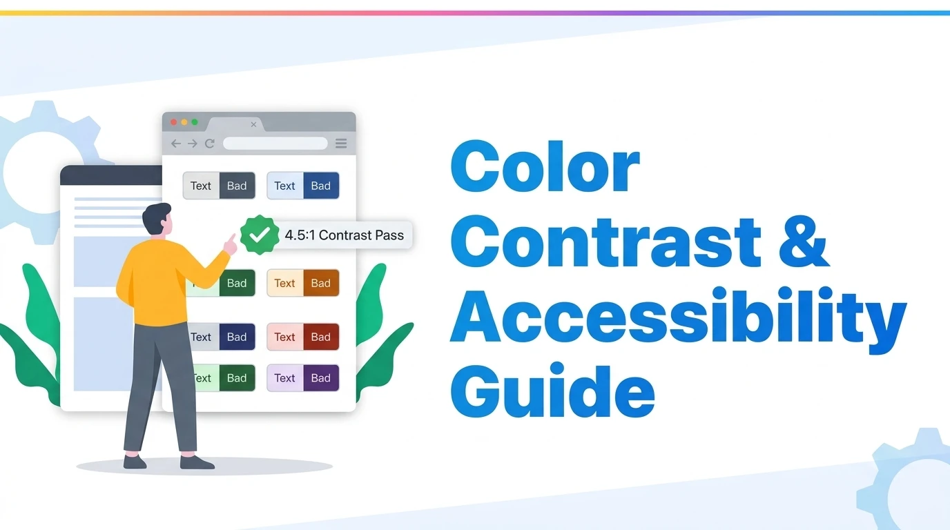
Under the official W3C WCAG 2.2 Level AA standard, body and normal text requires a minimum contrast ratio of 4.5:1 against its background, large text (≥ 24px regular or ≥ 18.66px bold) requires at least 3:1, and non-text interactive user interface components (including button borders, form input edges, and focus appearance rings) require a minimum contrast ratio of 3:1.
Executive Summary: Contrast as a Fundamental Legal & UX Standard
Color contrast is the single most pervasive accessibility failure on the modern web. In the annual WebAIM Million audit of the world's top one million homepages, over 81% of websites failed basic color contrast requirements, averaging over 30 distinct low-contrast errors per page.
Contrast is not merely an accommodation for users with severe vision loss or color blindness; it affects every human using a mobile device in bright direct sunlight, seniors with natural optical lens aging, and desktop users working under high-glare office lighting. With the enforcement of the European Accessibility Act (EAA) and statutory requirements under ADA Title II, meeting WCAG 2.2 contrast compliance is now an imperative legal and engineering mandate.
1. The Mathematics of Relative Luminance & Contrast Ratios
How is contrast mathematically determined? The W3C specification does not calculate raw RGB color wheel distances; it calculates the relative luminance ($L$) of colors based on human eye sensitivity (the Photopic luminosity curve):
// W3C Relative Luminance Formula:
L = 0.2126 * R_sRGB + 0.7152 * G_sRGB + 0.0722 * B_sRGB

// Contrast Ratio Formula:
Ratio = (L1 + 0.05) / (L2 + 0.05)
Where L1 is the relative luminance of the lighter color,
and L2 is the relative luminance of the darker color.
Contrast ratios span from 1:1 (identical colors with zero perceptible difference) to 21:1 (the absolute theoretical maximum: pure black #000000 against pure white #FFFFFF).
2. The Core WCAG 2.2 Standards: Level AA vs. Level AAA
| UI Element Type | Level AA (Standard) | Level AAA (Enhanced) | Target Resolution Criteria |
|---|---|---|---|
| Normal Text | 4.5:1 minimum | 7.0:1 minimum | < 18pt regular or < 14pt bold |
| Large Text | 3.0:1 minimum | 4.5:1 minimum | ≥ 18pt regular (~24px) or ≥ 14pt bold (~18.66px) |
| UI Components | 3.0:1 minimum | N/A | Active button borders, input outlines, icons |
| Focus Appearance | 3.0:1 minimum | 3.0:1 + perimeter rules | Keyboard navigation indicator outline ring |
The Non-Text Contrast (3:1) Rule for UI Components
A common misconception is that contrast applies only to written sentences. Under WCAG 2.1 and 2.2, graphical objects and user interface components—such as form input borders, checkboxes, radio toggles, tab indicators, and standalone navigational icons—must achieve a 3:1 contrast ratio against the surrounding canvas. If an input field border is faint gray (#E2E8F0) on a white page, a low-vision user cannot perceive where to click.
Focus Appearance Requirements in WCAG 2.2
Introduced in WCAG 2.2, Focus Appearance mandates that when a keyboard user presses Tab, the visual focus indicator must have a contrast ratio of at least 3:1 against adjacent colors across a minimum perimeter area of at least 2 CSS pixels thickness. Removing focus outlines with outline: none without an accessible replacement is an immediate audit failure.
Audit Any Color Pair with the BrivTools Contrast Checker
Test hex codes, RGB values, and CSS variables against WCAG 2.2 Level AA and AAA standards in real time. Features instant pass/fail badges, luminance curves, and accessible color suggestions.
3. The "Subtle Gray" Trap in Modern Minimalist Design
The most frequent source of contrast failure across web startups is the aesthetic desire for low-contrast "minimalism". Designers frequently use light gray text for secondary metadata, publishing dates, copyright footers, and form input placeholders.
This is #999999 text on pure white background. It fails WCAG AA by a wide margin.
Verdict: FAIL (2.85:1). Severe barrier for seniors and mobile screens in sunlight.
This is #475569 (Slate-600) text on pure white background. It effortlessly passes Level AA and AAA.
Verdict: PASS (7.4:1). Clean, legible, professional, and compliant.
4. Calculating Contrast Across Gradients & Hero Imagery
When typography sits on top of a photographic background or a multi-stop CSS gradient, automated auditors test the worst-case coordinate luminance.
If your hero banner transitions from dark navy to bright cyan, white text will meet contrast over the navy region but completely fail over the cyan region. To guarantee compliance:
- Apply an opaque or semi-transparent background scrim layer behind text blocks (
rgba(15, 23, 42, 0.75)). - Verify your gradient stop coordinates with the BrivTools CSS Gradient Generator.
- Avoid thin font weights (≤ 300) when placing text over textured backgrounds.
5. Baking Accessibility into CSS Variables & Design Tokens
The most sustainable way to prevent contrast regression across engineering teams is to enforce accessible design tokens at the theme level:
:root {
  /* Surface backgrounds */
  --bg-canvas: #ffffff;
  --bg-card: #f8fafc;

  /* Typography tokens guaranteed to pass 4.5:1 on --bg-canvas */
  --text-primary: #0f172a;    /* 15.8:1 - High contrast */
  --text-secondary: #475569;  /* 7.4:1  - Level AAA pass */
  --text-muted: #64748b;      /* 4.9:1  - Level AA pass */

  /* Interactive component boundaries guaranteed to pass 3:1 */
  --border-interactive: #94a3b8; /* 3.2:1 - Form inputs */
  --focus-ring: #4f46e5;         /* 4.8:1 - Focus appearance */
}
6. How to Test & Audit Contrast in 3 Minutes with BrivTools
Open BrivTools Color Contrast Checker
Navigate to the BrivTools Color Contrast Checker. Enter your foreground text color and background canvas color.
Inspect Real-Time WCAG 2.2 Badges
The tool evaluates Normal Text, Large Text, UI Components, and Enhanced Level AAA compliance simultaneously.
Generate Instant Accessible Alternatives
If your color pair fails, use the slider to automatically tweak hue and luminance until a green PASS indicator is achieved.
7. Frequently Asked Technical Questions
Do disabled buttons and form fields need to meet the 3:1 contrast ratio?+
While disabled elements are technically exempt, accessibility best practices advise against making them so faint that low-vision users cannot perceive their existence. Using distinct icons or tooltips explaining why an element is disabled provides a superior user experience.
What is the exact definition of 'Large Text' under WCAG?+
Text smaller than these exact pixel thresholds is classified as 'Normal Text' and must satisfy the stricter 4.5:1 contrast ratio to pass WCAG Level AA compliance. Body copy at 16px bold does not qualify as large text and must pass 4.5:1.
Why does dark mode often fail WCAG contrast audits?+
In dark themes, saturated colors appear dark because their relative luminance is low. To achieve accessible contrast in dark mode, brand colors must be tinted with white to raise their luminance value above the 4.5:1 or 3:1 threshold against dark backgrounds.
What legal risks exist for websites failing WCAG color contrast?+
Low contrast remains the single most common automated accessibility barrier discovered on the web (found on over 80% of audited homepages). Because contrast can be programmatically tested in seconds, it is the primary target for automated accessibility litigation.
Strategic Conclusion: Accessible Design is Better Business
Accessibility and beautiful modern aesthetics are not mutually exclusive. By validating color palettes against WCAG 2.2 standards, engineering teams eliminate legal audit vulnerabilities while creating digital experiences that are faster to read, higher converting, and genuinely welcoming to every user.